Accordion
Required: components.less, components.js
Basic Usage
Accordion title


		Accordion content
HTML Structure
Accordion title
Accordion content
Customization
| Class | Description |
|---|---|
| .c-accordion-head | Mandatory. The title of the accordion. Triggers on click. |
| .c-accordion-body | Mandatory. The wrapper for the content. Required to calculate the content’s height accurately. |
| .c-accordion-body__content | Mandatory. The accordion’s content. |
| Attribute | Description |
| aria-expanded | Mandatory. The state of the accordion. |
| data-responsive | Optional. Enables the accordion at a desired screen width. Values are the same as the ones used in the framework. |
| data-overflow-visible | Optional. Use when the content inside the accordion body needs to overflow. |
Badge
Required: components.less
Basic Usage
HTML Structure
20% off
Styles
Badges do not have default background colors, make sure to set one.
Variations
Small Badge
You can get a small badge by adding the c-badge--sm class to the root element:
20% off
Large Badge
You can get a large badge by adding the c-badge--lg class to the root element:
20% off
Customization
| Class | Description |
|---|---|
| .c-badge | Mandatory. The badge. |
| .c-badge--sm | Optional. Styles badge’s height to 24px. |
| .c-badge--lg | Optional. Style the badge’s font to 18px. |
Burger
Required: components.less
Basic Usage
HTML Structure
Customization
| Class | Description |
|---|---|
| .c-burger | Mandatory. The burger’s wrapper. |
| .c-burger__input | Mandatory. The burger’s input. |
| .c-burger__bars | Mandatory. The burger’s bars. |
Checkbox
Required: components.less
Basic Usage
HTML Structure
Variations
Disabled
You can disable a checkbox by adding the disabled attribute to the <input> element and c-checkbox--disabled to the root element:
Customization
| Class | Description |
|---|---|
| .c-checkbox | Mandatory. Wrapper for the checkbox. |
| .c-checkbox__label | Recommended. Label for the checkbox. |
| .c-checkbox__input | Mandatory. The checkbox’s input. |
| .c-checkbox__check | Mandatory. The custom checkbox. |
| .c-checkbox--disabled | Optional. Styles the checkbox to the disabled state. Use with disabled attribute. |
Color Swatch
Required: components.less
Basic Usage
HTML Structure
Variations
X-Small Color Swatch
You can get an x-small color swatch by adding the c-color-swatch--xs class to the root element:
Small Color Swatch
You can get a small color swatch by adding the c-color-swatch--sm class to the root element:
Large Color Swatch
You can get a large color swatch by adding the c-color-swatch--lg class to the root element:
Color Swatch (More)
You can get a "see more" color swatch by adding the c-color-swatch--more class to the root element:
Customization
| Class | Description |
|---|---|
| .c-color-swatch | Mandatory. The color swatch wrapper. |
| .c-color-swatch--sm | Optional. Styles the color swatch to a smaller 32px by 32px one. Use with c-color-swatch. |
| .c-color-swatch--lg | Optional. Styles the color swatch to a bigger 48px by 48px one. Use with c-color-swatch. |
| .c-color-swatch--more | Optional. Styles the color swatch to a plus icon indicating more colors are available. Use with c-color-swatch. |
| .c-color-swatch__input | Mandatory. The color swatch input. |
| .c-color-swatch__image | Mandatory. The color swatch image. |
360 Viewer
Required: components.less, components.js
Basic Usage
The component cycles through all img tags that are direct children of the c-360-viewer component and shows or hides the appropriate one.
HTML Structure


Customization
| Class | Description |
|---|---|
| .c-360-viewer | Mandatory. The 360 viewer wrapper. |
Divider
Required: components.less
Basic Usage
Some content here

Some content here
HTML Structure
Some content here
Some content here
Variations
X-Small Divider
Title here

Content here
You can get an x-small divider by adding the c-divider--xs class to the root element:
Title here

Content here
Small Divider
Title here
Content here
You can get an x-small divider by adding the c-divider--xs class to the root element:
Title here
Content here
Customization
| Class | Description |
|---|---|
| .c-divider | Mandatory. The default divider, takes all the available space. |
| .c-divider--xs | Optional. Limits the divider's width to 48px. |
| .c-divider--lg | Optional. Limits the divider's width to 400px. |
Dropdown Select
Required: components.less, components.js
Basic Usage
HTML Structure
Variations
Large Dropdown Select
You can get a large dropdown select by adding the c-dropdown--lg class to the root element:
Fullwidth Dropdown Select
Dropdown selects have a maximum width of 320px by default. You can make dropdown selects use all the available space by adding the c-dropdown--fullwidth class to the root element:
Disabled
You can disable a dropdown select by adding the disabled attribute to the <select> element:
Customization
| Class | Description |
|---|---|
| .c-dropdwon | Mandatory. Sets the style of the dropdown select. |
| .c-dropdown--lg | Optional. Sets the height of the dropdown select to 56px. |
| .c-dropdown--fullwidth | Optional. Makes the dropdown select use all the available space. Use with c-dropdown. |
Gallery
Required: components.less
Basic Usage
HTML Structure

Caption
Styles
The hover state is set on the .c-gallery-item and adds a box shadow to .c-gallery-item__image and changes the text color of .c-gallery-item__caption.
Customization
| Class | Description |
|---|---|
| .c-gallery-item | Mandatory. The wrapper for gallery item. |
| .c-gallery-item__image | Recommended. The gallery item image. |
| .c-gallery-item__caption | Recommended. The gallery item caption. |
Icons
Required: components.less
Basic Usage
HTML Structure
Variations
Outlined Fontello Icon
Fontello icons are usually reserved for simple icons that are repeated across the website. They also have the advantage of being customizable (color and outline). SVG icons should be reserved for more complex icons that have multiple colors.
Icon Using a Custom SVG
Upload your SVG to the /assets/images folder and add the SVG file name to the @icon_names list in /assets/less/components.less.
Customization
| Class | Description |
|---|---|
| .c-icon | Mandatory. The icon box. Needs an icon name to display said icon. |
| .c-icon--xxs | Optional. Scales the icon to 8px x 8px. |
| .c-icon--xs | Optional. Scales the icon to 18px x 18px. |
| .c-icon--sm | Optional. Scales the icon to 24px x 24px. |
| .c-icon--md | Optional. Scales the icon to 32px x 32px. |
| .c-icon--lg | Optional. Scales the icon to 40px x 40px. |
| .c-icon--xl | Optional. Scales the icon to 48px x 48px. |
| .c-icon--xxl | Optional. Scales the icon to 56px x 56px. |
| .c-icon--xxxl | Optional. Scales the icon to 64px x 64px. |
| c-icon--outlined-primary | Optional. Adds a 2px primary color text stroke. |
| c-icon--outlined-accent | Optional. Adds a 2px accent color text stroke. |
Input Group
Required: components.less, components.js
Basic Usage
HTML Structure
Variations
Full Width Input Group
Customization
| Class | Description |
|---|---|
| .c-input-group | Mandatory. Wrapper for the input group. |
| .c-input-group--fullwidth | Optional. Makes the input group take the full width of its container. |
| .c-text-field | Mandatory. The wrapper for the input and its label. |
| .c-text-field__input | Mandatory. The input. |
| .c-text-field__label | Recommended. The input’s label. |
| .c-btn | Mandatory. The interaction target. |
Message
Required: components.less
Basic Usage
HTML Structure
Button
Variations
Text Field With Error Message
Customization
| Class | Description |
|---|---|
| .c-message | Mandatory. The message itself. |
| .c-message--error | Optional. Styles the message to the error state. |
| .c-message--success | Optional. Styles the message to the success state. |
I am the modal!
And I close itModal
Required: components.less, components.js
Basic Usage
HTML Structure
I open the modal!


		I am the modal!
		And I close it
Styles
The attributes can be used independently from the component to add your own styles. The classes c-modal and c-modal__content are only for styling purposes and are not required for the component to work.
Customization
| Class | Description |
|---|---|
| .c-modal | Optional. Creates a fixed wrapper for the modal. |
| .c-modal__content | Optional. Centers the content in the c-modal container |
| Attribute | Description |
| data-modal | Mandatory. The modal’s id. Can be used on any div (typically c-modal). |
| data-modal-animate | Optional. Boolean (defaults to true). Use with c-modal to remove the modal opening animation. |
| data-modal-scroll-lock | Optional. Boolean (defaults to false). Use with c-modal to lock the body scroll when the modal is opened. |
| data-modal-overlay | Optional. Boolean (defaults to true). Use with data-modal to remove the overlay under the modal. |
| data-modal-open | Optional. Opens the modal with the same id if data-modal is used with c-modal. If not, it will simply add the class .is-active the whichever div the attribute is on. |
| data-modal-close | Optional. Closes the modal with the same id if data-modal is used with c-modal. If not, it will simply remove the class .is-active the whichever div the attribute is on. |
Multi Range
Required: components.less, components.js
Basic Usage
HTML Structure
Customization
| Class | Description |
|---|---|
| .c-multi-range | Mandatory. The multi range wrapper. |
| .c-multi-range__bar | Mandatory. The multi range track bar. |
| .c-multi-range__input | Mandatory. The multi range input. |
Notification
Required: components.less
Basic Usage
HTML Structure
Variations
Bottom Right Notification
Customization
| Class | Description |
|---|---|
| .c-notification | Mandatory. The notification bubble. |
| .c-notification--bottom-right | Optional. Places the notification bubble at the bottom right. |
| Attribute | Description |
| data-counter | Mandatory. The number displayed in the notification bubble. The number will not be displayed if it is 0. |
Overlay
Required: components.less
Basic Usage
To simplify the use of overlays, one has been added permanently at the bottom of the footer. To show the overlay, simply add the is-active class to it.
JavaScript Example
$('.c-overlay').addClass('is-active');
JavaScript
A click event on the c-overlay component has already been added and will remove the is-active class when clicked.
Variations
Overlay Below Header
$('.c-overlay').addClass('is-active is-below-header');
Customization
| Class | Description |
|---|---|
| .c-overlay | Mandatory. The overlay wrapper. |
| .is-active | Optional. Shows the overlay. |
| .is-below-header | Optional. Sets the overlay below the header. |
Product Grid Item
Required: components.less
Basic Usage
HTML Structure
Customization
| Class | Description |
|---|---|
| .c-product-item | Mandatory. The product grid item’s wrapper. |
| .c-btn--fab | Optional. The product grid item’s floating action button. It will be placed at the top right corner. |
| .c-product-item__image | Recommended. The product grid item’s image container. |
| .c-badge | Optional. The product grid item’s badge. It will be placed at the top left corner of the image. |
| .c-product-item__color-swatch-container | Recommended. The product grid item’s color swatches container. Use with the color swatch component. |
| .c-product-item__title | Recommended. The product grid item’s title. |
| .c-product-item__subtitle | Optional. The product grid item’s subtitle. |
| .c-product-item__price | Recommended. The product grid item’s prices container. |
| .c-product-item__price--promo | Recommended. The product grid item’s promotional price. |
| .c-product-item__price--reg | Recommended. The product grid item’s regular price. The price styling will be ajusted if a promotional price exists. |
Product Slideshow
Required: components.less, components.js, slick.js
Basic Usage
HTML Structure
Customization
| Class | Description |
|---|---|
| .c-product-slideshow | Mandatory. The carrousel’s wrapper. |
| .u-arrows-slider | Optional. Styles the carrousel’s arrows. |
| .c-product-slideshow__item | Mandatory. The carrousel’s product. |
| .c-product-slideshow__item__image | Mandatory. The product’s image. |
| .c-product-slideshow__item__title | Mandatory. The product’s title. |
| .c-product-slideshow__item__price | Mandatory. The product’s price container. |
| .c-product-slideshow__item__price--reg | Mandatory. The product’s regular price. |
| .c-product-slideshow__item__price--promo | Mandatory. The product’s promotional price. |
Product Card
Required: components.less, components.js
Basic Usage
HTML Structure
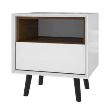
 End Table
1000$
2000$
SKU 187263
Variations
Small Product Card

Add the c-product-card--sm class to the root element to get a small product card.
 End Table
SKU 187263-32
Large Product Card

Add the c-product-card--lg class to the root element to get a large product card.
 End Table
1000$
2000$
Auva
SKU 187263
Customization
| Class | Description |
|---|---|
| .c-product-card | Mandatory. The product card's container. |
| .c-product-card--sm | Optional. Sets the product card to its smaller variation. |
| .c-product-card--lg | Optional. Sets the product card to its larger variation. |
| .c-product-card__image | Recommended. The product card's image. |
| .c-product-card__content | Mandatory. Wraps the product card's content. |
| .c-product-card__title | Mandatory. The product's title. |
| .c-product-card__price | Optional. The product's price container. |
| .c-product-card__price--promo | Optional. The product's promotional price. |
| .c-product-card__price--reg | Mandatory. The product's regular price. |
| .c-product-card__colors | Optional. The product card's color swatches container. |
| .c-product-card__content__bottom-row | Optional. The product card's bottom row. |
| .c-product-card__collection | Optional. The product's collection. |
| .c-product-card__sku | Optional. The product's sku. |
Radio
Required: components.less
Basic Usage
HTML Structure
Variations
Disabled Radio
To disable a radio button, set the disabled attribute on the <input> element. Disabled radio buttons cannot be interacted with and have no visual interaction effect.
Customization
| Class | Description |
|---|---|
| .c-radio | Mandatory. Wrapper for the radio. |
| .c-radio__label | Recommended. Label for the radio. |
| .c-radio__input | Mandatory. The radio’s input. |
| .c-radio__check | Mandatory. The custom radio button. |
Scrollbar
Required: components.less, components.js
Basic Usage
HTML Structure
...
Customization
| Class | Description |
|---|---|
| c-scrollbar | Mandatory. The wrapper for the scrollbar. |
| c-scrollbar__touch-target | Mandatory. Creates a larger touch area for better accessibility. |
| c-scrollbar__thumb | Mandatory. Yhe scrollbar's thumb. |
| c-scrollbar__track | Mandatory. Yhe scrollbar's track. |
| Attribute | Description |
| data-scrollbar-for | Mandatory. Add to the section you want to scroll through. |
| data-scrollbar | Mandatory. Targets the section the scrollbar controls. |
Shoppable Images
Required: components.less, components.js, wp-rocket
Basic Usage
HTML Structure
<-?php echo c_shoppable_images(); ?->
PHP
/**
 * Prints one or more shoppable images
 *
 * @param integer $index           Number of shoppable image to loop through and display, defaults to all
 * @param string  $start_el        Add a string before the component element
 * @param string  $end_el          Add a string after the component element
 * @param string  $component_class Add a class to the component element
 *
 */
c_shoppable_images($index, $start_el, $end_el, $component_class)

// Example
echo c_shoppable_images(-1, '', '', 'custom-class');

// Would print


		...
Customization
| Class | Description |
|---|---|
| .c-shoppable-images | Mandatory. The component's wrapper. It is relative and will take all the available space by default. You can also make it absolute to inherit the dimensions of its parent. |
| .c-shoppable-images__image | Mandatory. The component's image. |
| .c-shoppable-images__products | Mandatory. The shoppable image products' container. |
| .c-shoppable-images__products__product | Mandatory. The shoppable image's tags. |
Skeleton Loading
Required: components.less
Basic Usage
HTML Structure
Styles
The skeleton component uses the :empty CSS propriety to hide or show the skeleton loading animation. It will remove its fixed dimensions once the <div> gets populated so you are left with a simple wrapper.
Variations
Skeleton Loading inside a Container
Skeletons can also have relative dimensions so they can be nested inside containers with dynamic dimensions. Again, the dimensions of the skeleton container will be removed once its content is loaded.
Customization
| Class | Description |
|---|---|
| .c-skeleton | Mandatory. The wrapper for the skeleton. |
| .c-skeleton--h-10 | Optional. Sets the height to 80px while empty. Values range from 10 to 50 and increment by steps of 10. Values 1, 2, 3, 5 and 8 are also available. The values follow the usual 8px grid. |
| .c-skeleton--w-10 | Optional. Sets the width to 80px while empty. Values range from 10 to 50 and increment by steps of 10. Values 1, 2, 3, 5 and 8 are also available. The values follow the usual 8px grid. |
| .c-skeleton--h-full | Optional. Sets the height to 100% while empty. |
| .c-skeleton--w-full | Optional. Sets the width to 100% while empty. |
Slider Bars
Required: components.less
Basic Usage
HTML Structure
CSS
.demo-slider-bars{
	&__item{
		display: none;
		&.is-active{
			display: block;
			animation: fade-in .5s ease;
		}
	}
}
Note
Never apply styling to classes with the js- prefix. They are reserved for JavaScript only.
Customization
| Class | Description |
|---|---|
| .c-slider-bars | Mandatory. The wrapper for the bars. Use with js-slider__controls. |
| .c-slider-bars__item | Mandatory. The bar. Must be a direct chidd to js-slider__controls__trigger. |
| .touch-container | Recommended. Creates a 24px x 24px touch surface. Use with js-slider__controls__trigger. |
Switch
Required: components.less
Basic Usage
HTML Structure
Variations
Initially "On" Switch
Add the checked attribute to the c-switch__input element to toggle the switch to "on".
Colored Switch
Add the c-switch--colored class to the root element to get a colored switch.
Switch With 2 Labels
Add a second c-switch__label element before the c-switch__slider element to get a switch with a label for both states.
Customization
| Class | Description |
|---|---|
| .c-switch | Mandatory. Wrapper for the switch. |
| .c-switch--colored | Optional. Makes the switch and label green when checked. |
| .c-switch__label | Recommended. Label for the switch. |
| .c-switch__input | Mandatory. The switch’s input. |
| .c-switch__slider | Mandatory. The switch itself. |
Tabs
Basic Usage
HTML Structure
		Tab #1
		Tab #2
		Tab #3


		Tab #1
		Tab #2
		Tab #3
Customization
| Class | Description |
|---|---|
| .c-tabs | Mandatory. The component's container. |
| .c-tabs__head | Mandatory. The tabs' head row. |
| .c-tabs__head__item | Mandatory. The tabs' head row items. |
| .is-active | Optional. The state of the tabs' head row item. |
| .c-tabs__body | Mandatory. The tabs' content container. |
| .c-tabs__body__content | Mandatory. The individual tab's content. |
| Attribute | Description |
| data-tab-trigger | Mandatory. Targets which data-tab-id will be triggered. |
| data-tab-id | Mandatory. The target. |
| aria-expanded | Mandatory. The state of the tab's content. |
Timer
Required: components.less
Basic Usage
HTML Structure
Customization
| Class | Description |
|---|---|
| .c-timer | Mandatory. The component's element. |
| Attribute | Description |
| data-count | Mandatory. The timer's count down. |
| data-unit | Recommended. The timer's count down unit. |
Typography
Required: components.less
Basic Usage
HTML Structure
Headline 1
Headline 2
Headline 3
Headline 4
Headline 5
Headline 6
Body
Body 2
Link
Variations
H2 Tag With Headline 6 Styling
Disguised H2
You can override default HTML tags styling by adding the c-typography--VARIANT class to the root element:
Disguised H2
Additional Information
Never override case, font size, font weight or letter spacing. If you come across a mock-up with a text that is not in the type system, ask the designer if it is intentional or absolutely necessary. If it is, do not create a new style. Simply override the default styling to style the text accordingly.
Customization
All the following tags have a default style applied to them: <h1>,<h2>,<h3>,<h4>,<h5>,<h6>,<p> and <a>. You can also style a tag with the following classes to override the default style when necessary (generally for SEO reasons).
| Class | Description |
|---|---|
| .c-typography | Sets the font to Sofia Pro. |
| .c-typography--headline1 | Sets font properties as Headline 1. Default style for h1 tag. |
| .c-typography--headline2 | Sets font properties as Headline 2. Default style for h2 tag. |
| .c-typography--headline3 | Sets font properties as Headline 3. Default style for h3 tag. |
| .c-typography--headline4 | Sets font properties as Headline 4. Default style for h4 tag. |
| .c-typography--headline5 | Sets font properties as Headline 5. Default style for h5 tag. |
| .c-typography--headline6 | Sets font properties as Headline 6. Default style for h6 tag. |
| .c-typography--body1 | Sets font properties as Body 1. Default style for p tag. |
| .c-typography--body2 | Sets font properties as Body 2. Use with p tag. |
| .c-typography--link | Sets font properties as Link. Use with a tag. |
Text Area
Required: components.less, components.js
Basic Usage
HTML Structure
Customization
| Class | Description |
|---|---|
| .c-textarea | Mandatory. Wrapper for the the text area. |
| .c-textarea__input | Mandatory. The text area’s input. |
| .c-textarea__label | Recommended. The text area’s label. |
Text Field
Required: components.less, components.js
Basic Usage
HTML Structure
Variations
Text Field with Floating Label
All text fields should have a floating label unless specified otherwise. You can get a floating label by adding the c-text-field--floating class to the root element:
...
Fullwidth Text Field
Text fields have a maximum width of 320px by default. You can make text fields use all the available space by adding the c-text-field--fullwidth class to the root element:
...
Text Field with Leading and Trailing Icons
Leading and trailing icons can be added within a text field as visual indicators as well as interaction targets. Padding and left property must be adjusted manually on the c-text-field__input and c-text-field__label elements to ensure they do not collapse with the text entered by the user (as shown here by the left-6 and px-6 classes):
Small Text Field with Helper Label
Note: it is not recommended to use c-text-field--floating with small text fields.
You can get a small text field by adding the c-text-field--sm class to the root element:
in
Large Text Field
You can get a large text field by adding the c-text-field--lg class to the root element:
Read-only
You can make a read-only text field by adding the readonly attribute to the <input> element:
...
Disabled
You can disable a text field by adding the disabled attribute to the <input> element:
...
Customization
| Class | Description |
|---|---|
| .c-text-field | Mandatory. Wrapper for the field. |
| .c-text-field--floating | Optional. Styles the label to a floating label. Use with c-text-field. |
| .c-text-field--sm | Optional. Sets the text field’s height to 40px. Use with c-text-field. |
| .c-text-field--lg | Optional. Sets the text field’s height to 56px. Use with c-text-field. |
| .c-text-field--fullwidth | Optional. Makes the text field use all the available space. Use with c-text-field. |
| .c-text-field__input | Mandatory. The text field’s input. |
| .c-text-field__label | Recommended. The text field’s label. |
| .c-text-field__prefix | Optional. Adds a prefix to the start of the text field. Additional padding might be required to insure the prefix does not collapse with the text entered by the user. |
| .c-text-field__suffix | Optional. Adds a suffix to the end of the text field. Additional padding might be required to insure the suffix does not collapse with the text entered by the user. |
Toast
Required: components.less, components.js
Basic Usage
HTML Structure
Variations
Successful toast
To show a success message, use the c-toast--success class. The “Success” label will appear automatically and will be translated based on the HTML lang attribute.
Error toast
To show an error message, use the c-toast--error class. The “Error” label will appear automatically and will be translated based on the HTML lang attribute.
Additional Information
Toasts can either be printed on page load or updated with the is-active class to prompt the user with the desired message. Toast that were printed on page load will not automatically disappear.
Customization
| Class | Description |
|---|---|
| .c-toast | Mandatory. Wrapper for the toast. |
| .is-active | Optional. Add this class to c-toast to show the toast for 5 seconds. The class is then automatically removed. |
| .c-toast--success | Optional. Ajusts the toast style and title to show the action was successful. |
| .c-toast--error | Optional. Ajusts the toast style and title to show the action was an error. |
| .c-toast__message | Mandatory. The toast message. |
| .c-toast__action | Recommended. Dismisses the toast when the user clicks the icon. |
Toggle
Required: components.less
Basic Usage
HTML Structure
Customization
| Class | Description |
|---|---|
| .c-toggle | Mandatory. Wrapper for the toggle. |
| .c-toggle__input | Mandatory. The toggle’s input. |
| .c-toggle__track | Mandatory. The toggle itself. |
| .c-toggle__label | Mandatory. The two states of the toggle. |
Unordered List
Required: components.less
Basic Usage
- Item 1
- Item 2
- Item 3
HTML Structure
- Item 1
- Item 2
- Item 3
Additional Information
Every <ul> tag nested inside #content or .content will have this style by default, use the .c-unordered-list class to style any lists outside the main page content.
Customization
| Class | Description |
|---|---|
| .c-unordered-list | Mandatory. Sets the style of the list. |

